
- Markets
Find out what influences market movements by browsing through our tailor made product pages.
- Trading Platforms
Maximise your investment opportunities
Trading Platforms
In order to ensure our customers have the best trading experience. We are proud to introduce our suite of trading platforms.
- Axi Select
- Accounts
All accounts can be opened using one application form.

OPEN A LIVE ACCOUNT
The application process is simple and straightforward. You can complete the online application form and be trading in minutes.
- Education
Here you will find all the details regarding One Financial Markets educational offering

TRADING ACADEMY
Working through each of our six online modules, detailed below, you can develop your trading confidence
- News

- Contact Us


4. Analysis
Trading isn’t a guessing game; you’ve got to plan your work and work your plan.
The Technical vs. the Fundamental
Technical and Fundamental Analysis are both tools used by traders to help determine a trading strategy. Both fundamental and technical analysis help traders to predict possible trends and future prices.
Technical Analysis; “The process of analysing a financial instrument's historical prices and other statistics generated by market activity, in an effort to determine probable future prices”
Fundamental Analysis; “'The determination of price based on future earnings – it focuses predominantly on factors such as the overall state of the economy, interest rates, production, earnings, and management”
Here it is put simply;
Technical analysis looks at past prices of an asset to predict future prices, and Fundamental Analysis believes that market movement is determined by macro and micro economic factors including interest rates, war, political unrest, recession, global economic depression etc.
Essentially the fundamentalist studies the cause of market movement, while the technician studies the effect
There are probably a million questions running through your mind;
- “Which one is better?”
- “What’s the difference between the two?”
- “Can I use them both?”
- “How do I analyse?”
- “What do I analyse?”
So, let’s start from the very beginning…
The Basics of the Fundamentals
Fundamental analysis is a method of evaluating an asset; it attempts to measure its intrinsic value by examining the underlying forces that could affect the asset.
Fundamental Analysis includes;
- Geo Political factors – such as interest rates and other government policies
- Macroeconomic factors – such as the level of unemployment
- Company or industry specific factors – such as mergers or acquisitions
Why is it useful?
So why is Fundamental Analysis used so widely, and what does it help us achieve and understand?
- Through fundamental analysis we are able to determine the overall health of an economy to give us a mid to long term outlook as to the direction of the markets
- Fundamental Analysis helps us to measure an asset's intrinsic value. The idea behind fundamental analysis is that each asset has a “correct” price which means we can determine if the current market price is overvalued or undervalued. Keeping in mind that the price will always revert back to what is “correct”, knowing whether the asset is under or overvalued gives us an indication as to whether to buy or sell.
Major Industrialized Nations Central Banks
Below is a list of a few major industrialised nations, their central banks and the chairman or governor:
- USA - The Federal Reserve [FOMC - Federal Open market Committee] - Chairman: Janet Yellen
- Europe - European Central Bank [ECB] - Chairman: Mario Draghi
- UK - Bank of England [BoE (MPC - Monetary Policy Committee)] - Governor: Mark Carney
- Japan - Bank of Japan [BoJ] - Governor: Haruhiko Kuroda
Central banks make decisions that affect the economy, and decisions that affect the economy are decisions that will affect your trading so if you ever see any of these guys on TV listen closely to what they say, because odds are, it’s something pretty important.
Every time the chairman of the FOMC, Janet Yellen, gives a speech everybody is playing the guessing game trying to figure out what’s going to happen with the interest rates.
Interest rate can be defined as;
'The cost of borrowing money expressed as a % of loan value'
Understanding Interest rates is important when talking about factors such as the money supply or inflation because central banks use the manipulation of interest rates to control the money supply and combat inflation.
You might be wondering why this is important to you, well; changes in interest rate cause changes in the economy and changes in the economy affect your trading.
Example: Increasing the interest rates
This effectively makes borrowing money less easy and as a result the amount that people spend goes down. The decrease in expenditure means that the demand for many goods goes down, and as a result, their price will also decrease.
The central bank will often increase interest rates when they fear the economy is “inflamed” – they make borrowing less easy to reduce expenditure and cool the economy down in order to avoid inflation.
Example: Decreasing the interest rates
This effectively allows us to borrow money more easily and as a result the amount that people spend goes up. The increased expenditure means that there is also an increase in the demand for many goods, and as the demand for these goods increases so too will their prices.
The central bank will lower interest rates when they feel as though the economy is facing a potential recession, interest rates will be reduced to encourage spending and promote the growth of the economy.
The main role of any central bank is to control a country’s money supply.
By decreasing borrowing costs, central banks are effectively increasing the money supply.
The money supply is a measure of the entire amount of bills, notes, coins, loans, credit and other liquid instruments in circulation within a country’s economy.
Money supply is measured by M0, M1, M2 and M3, with M0 being the narrowest measure of money (cash and liquid assets), and M3 being the broadest.
The money supply is an important factor to keep an eye on, especially if you want to trade FX.
Increased money supply demonstrates early signs of inflation – if the supply of money exceeds the supply of goods prices are likely to rise – hello inflation.
Back in the day the government used to set targets for the growth rate of the money supply and would often manipulate interest rates to force the supply to fall in line with their suggested brackets. In fact, many stipulate that the over manipulation of interest rates back in the 80s [a period when the US government believed the money supply was growing proportionately out of control] was actually responsible for the economic recession of that time.
It seems they learnt their lesson; governments don’t force the monetary growth to fall within their target brackets anymore. Governments nowadays just “play it by ear” waiting for the right moment to do the right thing in order to maintain stability, keep inflation in check, and promote sustainable growth.
What is inflation?
We’ve spoken about inflation a lot in this module, and in case you haven’t got it yet; put simply inflation is 'Rising prices'.
It can also be described as the sustained increase in the prices of goods and services.
What does inflation do?
Inflation causes what we call an erosion of the purchasing power of your money.
I.e. your money is worth less, you can buy less with your buck [or pound or euro] and its all because of inflation.
What causes inflation?
There are two maincauses of Inflation:
Demand-Pull Inflation; this form of inflation occurs when aggregate demand outweighs aggregate supply. When there is more demand than there is supply, prices increase = inflation.
Cost-Push Inflation; this form of inflation occurs as a result of an increase in say the prices of wages and or of raw materials. These increased costs cause supply to decrease and consequently the amount of demand will outweigh supply. Again, where there is more demand than there is supply, prices increase = inflation.
What are the different types of inflation?
- Hyper-Inflation - Extremely rapid or out of control rising inflation
- Deflation - Falling prices - The opposite of Inflation
- Stagflation - Sluggish economic growth accompanied with rising inflation
- Disinflation - Slowing of Inflation rate
Every given period of time, each country around the world will have what is called an economic release. A data release is the periodic publication of economic data and or news of a qualitative and quantitative nature.
These data or news releases help paint a picture of the overall health of a company or country’s economy. A stronger outlook for a company or country’s economy should be reflected by a higher company stock price or stronger domestic currency.
This data/news can have both a short and long term impact on prices and traders will look to benefit from any movement created by these economic data releases. So investors will make investment decisions based on their interpretation of the economic data which has been released.
Key Points of Economic Data
- The key to trading data is to look at the outcome of the data/news release in relation to the expected forecast.
- The larger the difference between the actual figure and the forecast figure, the greater the likely hood of a larger change in prices.
- The strength of importance of the data will also be a factor in determining strength of price moves.
An example of an economic data release is as follows;
U.S. Non-Farm Payrolls – [Released monthly] Measures the number of jobs created or lost each month excluding the agricultural sector.
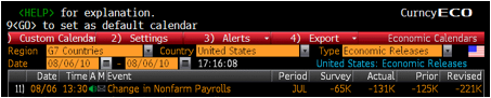
| For the month of July we can see that... | - | - |
|---|---|---|
| The forecasted figure is | = | -65k |
| The prior figure is | = | -125k |
| The actual figure is | = | -131k |
| And finally the revised figure is | = | -221k |
We can see here that the actual figure is more than two times the forecasted figure – and as we mentioned before the bigger the difference the more likely the fluctuation.
In this case, higher than expected unemployment rates is bad news, so there was an initial sell off on the Dollar.
Now that we’ve spoken about fundamental analysis, what it means and what it consists of, let’s take a closer look at technical analysis.
What is technical analysis?
Unlike fundamental analysis, which is concerned with an asset's intrinsic value and what its price should be, technical analysis focuses more on pattern recognition.
Technical analysis is a subjective art based on using past price movements to predict future outcomes. Put simply it helps investors to predict what will happen in the future by looking at what has happened in the past.
Why is technical analysis useful?
It’s a common misconception that all there is to technical analysis is lots of charts. There are plenty of skills involved in technical analysis which if applied, and applied correctly, are able to increase the probability of a winning trade by predicting the likely price action.
- Support & Resistance Levels + Pivot Points
- Trend Lines & Channels + Breakout Points
- Chart Patterns
- Trade Entry & Exit points
- Strategic Stop Loss points
Technical analysis can be looked at as another way of reducing your risk.
Support and resistance is a concept used within technical analysis that suggests that the market price of an asset will tend to fall and rise at certain predetermined levels.
Support
The support level is the level at which the price tends to find support as It is falling; it is more likely to “bounce” off this point rather than break through it. In the event that a price does in fact break through its support it will often continue to fall until a new support level is identified.
Resistance
Resistance is the opposite of support – the resistance level is the level at which the price tends to find resistance as it is going up, and again, it is more likely that the price will “bounce” off this level rather than break through it.
In the event that a price does break through its resistance level, it will often continue to rise until it finds another resistance level.
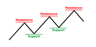
The diagram above gives an example of support and resistance levels.
The “zigzag” pattern that we see here has an upwards trend and shows us how new levels of support and resistance are determined as the market moves.
When the market moves up and then pulls back again the highest point before the fall was be identified as the price resistance level.
Similarly as the market then moves up again, the lowest point reached before the increase began is the support level.
The reverse of this is true for a downward trend
How do I find support and resistance?
Now that you have a general idea of what support and resistance levels are it's time to learn how to identify them.
Unfortunately it’s not as easy as A, B, C - support and resistance levels aren’t exact numbers that can be worked out using a formula or rule. A support or resistance level may appear to have broken but soon after we see that the market was just testing it and the support and resistance levels remain in place.
The fact that support and resistance levels are often depicted as lines, when they are not in fact exact figures is sometimes misleading – so it’s often simpler to think of support and resistance as zones as opposed to definitive levels.
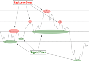
The two types of support and resistance
There are essentially two types of support and resistance – major and minor.
A price can move up for example, breaking the minor resistance in order to test the major resistance and as we can see below often a price move against the trend will be stopped by the minor resistance or support, and reverse.
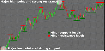
The more often a price tests the levels of support and resistance without actually breaking through them, the stronger the support and resistance zones are seen to be.
Trendlines
“The trend is your friend” is a quote used often by traders and the theory behind it is simple; it’s perceived as easy to make money trading in the same direction as the trend.
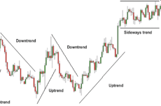
- An uptrend line (successive higher highs and higher lows) is depicted as a line drawn along the bottom of easily identifiable support areas.
- In a downtrend (successive lower highs and lower lows), the trend line is drawn along the top of easily identifiable resistance areas.
Channels
Channels can be seen as adding a dimension to the trend line theory we referred to earlier
A channel is created simply by drawing a parallel line at the same angle of the uptrend or downtrend to create a channel.
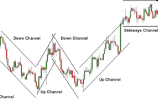
- To create an uptrend channel, draw a parallel line at the same angle as an uptrend line and then move that line to position where it touches the most recent high
- To create a downtrend channel, draw a parallel line at the same angle as the downtrend line and then move that line to a position where it touches the most recent low.
[This should be done at the same time you created the trend line]
When prices hit the bottom trend line this may be used as a buying area
When prices hit the upper trend line this may be used as a selling area
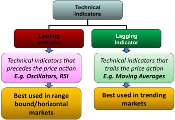
There are essentially two groups into which technical indicators fall – leading and lagging indicators.
- Leading indicators will change in advance of expected economic trends; they are often used to predict future movements but not always necessarily accurate.
- Lagging indicators are used to summarise past movements as opposed to predicting future; it changes after the economy has already begun to follow a particular pattern or trend.
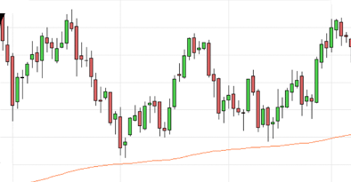
Moving Averages
A moving average is a type of technical indicator that traders use in order to calculate the average price of a security over a given time.
There are two different types of moving averages; simple moving average [SMA] and an exponential moving average [EMA]
Simple Moving Averages (SMAs)
A simple moving average is calculated by adding up the last “X” period’s closing prices and then dividing that number by X.
If you plotted a 10 period simple moving average on a 1 hour chart, you would add up the closing prices for the last 10 hours, and then divide that number by 10. There you have a simple moving average.
A simple moving average shows us the overall sentiment of the market at a point in time. It helps to show market direction by smoothing out market noise (price fluctuations) over time and can also be used to identify support and resistance as well as generating buy/sell signals.
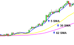
We can see here that the longer the SMA period is the more it lags behind the current price; i.e. the higher the number period you use the slower it is to react to a current price movement.
One problem that traders often experience with SMAs is that they are very susceptible to price spikes.
Exponential Moving Averages (EMAs)
EMAs place more weight on the most recent periods and react faster to recent prices than SMAs. The shorter the EMA period the higher the weight that the current price will carry in the MA curve – the opposite is also true.
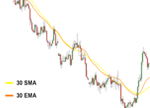
SMAs or EMAs
Now that you know the difference between simple and exponential moving averages you’re probably asking yourself when you would use them and more importantly, which one is better.
The answer is – either; it may sound cliché but, like most methods of analysis, it really depends on your trading style.
Let’s go through the pros and cons of both SMAs and EMAs to help you work out which falls in line better with your trading strategy.
EMAs respond faster to price movements and help you catch recent trends faster and more accurately than simple moving averages.
BUT
EMAs react SO quickly to price movements that often a price spike can be misinterpreted as the beginning stages of a trend.
SMAs are better when you are looking at a more long term and general movement of the market. It is best applied to trends over longer periods of time and avoids the misleading price spikes encountered when using EMAs.
BUT
Although beneficial when taking a long term view, the slow reaction experienced when using SMAs causes a price lag which can make short term movements harder to take advantage of.
Now that we have compared the two, it’s really up to you to decide which you would like to use. Take into consideration whether you are looking to gauge a long term trend, or looking to take advantage of a short term movement.
If you’re ever in doubt which to use, there’s no harm in using both; EMA to get a general idea of the overall trend, and SMA to take advantage of short term movements.
How to use moving averages
Moving averages are used to facilitate lots of trading strategies such as;
- Identifying trendsand reversals
- Measuring the strength of market’s momentum
- Recognising support and resistance levels
- Spotting potential entry and exit points
Identifying trends
As mentioned before, moving averages are lagging indicators; they do not predict new trends, but confirm trends once they have started.
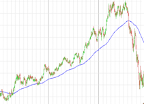
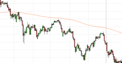
Moving averages are often used to identify trends as displayed in the graph above. When the price of the product is higher than that of the moving average then the price can be said to be in an uptrend. For example many traders will only consider going long when the price is trading above a moving average.
The opposite is also true; in instances where there is a downward slope with the graph displaying prices lower than the moving average traders will use this to confirm a downtrend.
Identifying momentum with Moving Averages
The strength and direction of a market's momentum can also be assessed by the use of moving averages.
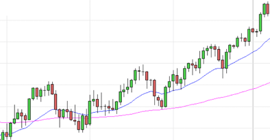
On the graph below three moving averages have been applied;
Blue - EMA50 [short term]
Pink - EMA100 [medium term]
Orange - EMA200 [long term]
The three moving averages used here have varying time frames in an attempt to represent short-term, medium-term and long-term price movements.
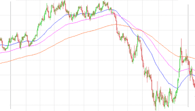
In this graph an upward momentum can be seen in instances where the shorter-term averages are located above longer-term averages.
When the shorter-term averages are located below the longer-term averages, the momentum is in the downward direction.
Finding Support and Resistance with Moving Averages
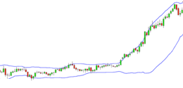
The falling price of a market can stop and reverse direction at the same level as an important average. This means that moving averages can often be used to identify support and resistance levels on a chart.
An example can be seen in the graph below when the 200-day moving average can be seen to have provided a support level.
Moving averages that are based on longer time periods will give you a stronger and reliable view of a support level than shorter time frames.
In cases where the price falls below an important moving average it can then act as a resistance level which traders often use as a sign to take profits or to close out any existing long positions.
Traders also use these averages as entry points to go short because the price often bounces off the resistance and continues its move lower.
Finding crossovers with Moving Averages
Moving Averages can be used to generate buy and sell signals by identifying when an uptrend or downtrend is starting
As we discussed previously moving averages can be used to define up and downtrends. Moving averages can also therefore be used as a signal to buy or sell.
A cross above a moving average can be a signal to go long or close out a short position.
A cross below a moving average can be a signal to go short or close out a long position.
The most common type of crossover is when the price moves from one side of a moving average and closes on the other – this can be seen on the graph below.
Blue - EMA20 [short term]
Pink - EMA100 [long term]
When a short-term average crosses through a long-term average it can mean momentum is shifting in one direction and that a strong move is approaching.
A buy signal is when the short-term average crosses above the long-term average.
A sell signal is when a short-term average crosses below a long-term average.
As mentioned before leading indicators will change in advance of expected economic trends; they are often used to predict future movements but not always necessarily accurate.
Now that we have discussed moving averages, an example of a lagging indicator, let us move on to the Relative Strength Index which is a type of leading indicator.
Relative Strength Index (RSI)
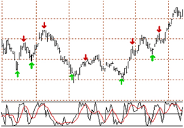
The Relative Strength Index [RSI] determines the speed and change of price movements; it allows traders to measure the buying or selling momentum of a product. RSI oscillates between 0 and 100 and generally a market is thought to be overbought once the RSI approaches 70. This is a good indication that the asset may be getting overvalued and is a good candidate for a pullback.
Conversely in instances where the RSI approaches 30, it is an indication the market may be oversold and therefore the asset is likely to become undervalued.
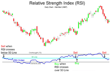
What does Overbought mean?
In technical analysis, overbought is a situation in which the price of a market has risen to such a degree - usually on high volume - that an oscillator, for example an RSI, has reached its upper bound.
Put more simply it is when the demand for a product pushes the price of a market up to unjustifiable levels.
Generally when a product is overbought it is an indication that the market is becoming overvalued and may experience a pullback.
What does Oversold mean?
Oversold is simply the opposite to overbought.
Oversold is a condition in which the price of a market has declined too steeply and too fast in relation to underlying fundamental factors. This condition is usually a result of market overreaction or panic selling.
Overselling is generally interpreted as a sign that the price of the asset is becoming undervalued and may represent a buying opportunity for investors.
Hopefully it is now more clear to you what it means to say an asset is overbought or oversold, but please remember that determining the degree in which an asset is overbought or oversold is very subjective and can differ between traders.
Stochastic Oscillator
Stochastic Oscillator is another example of a leading indicator; it is a momentum indicator that measures the speed of change of price or the impulse of price. It does this by comparing an asset’s closing price against its price range over a given time period.
Similar to RSI Stochastic Oscillators also have levels that indicates potential trends or points of entry or exit
Traders will often look to sell when the Stochastic Oscillator line rises above 80m predicting that it will inevitably then fall back below. Traders will also look to buy when the level falls below 20 predicting that it will increase above this level.
Another way of utilising stochastic oscillators is to watch timing trades. The graph below gives an example of this;
%K = Black
%D = Red
%K = (Current Close - Lowest Low)/ (Highest High - Lowest Low) * 100
%D = 3-day SMA of %K
The %K is called the faster moving of the two lines and compares the latest closing price to the recent trading range. %D is a signal line calculated by smoothing out %K; It is a 3-day simple moving average of %K which is plotted alongside %K to act as a signal or trigger line.
Traders will look to sell when the %K (Fast) line shifts below the %D (Slow) line and will look to buy when the %K line shifts over the %D line.
The theory behind this indicator is that in an upward-trending market, prices tend to close near their high, and during a downward-trending market, prices tend to close near their low. Transaction signals occur when the %K crosses through a three-period moving average called the "%D".
The sensitivity of the oscillator can be adjusted by changing the time period for the %D or %K lines.
Bollinger bands is an analytical tool used by traders to identify a market’s volatility and looks at the levels of current prices relative to previous trades.
We can see from the above graph that in an instance where there is little volatility the bands contract and as the market becomes increasingly volatile the bands expand.
It may be simpler to look at Bollinger bands as a form of support and resistance.
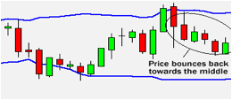
Often what is seen with Bollinger bands is that as the price deviates within the band it often tends to return back to a middle ground; this is what is known as the Bollinger Bounce.
Often the bands can be seen to “squeeze” together such as in the graph below:
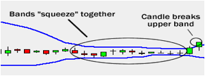
Many traders see a band squeeze as an indication that there is a pending breakout in the market. If the graph is seen to move towards the upper band then an upwards trend is usually expected. The opposite is true when the candlestick is seen to be approaching the lower bound.
An example of a “breakout can be seen below”:
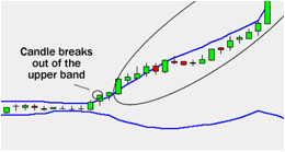
It is not an often occurrence to see a Bollinger squeeze; when looking at a 15 minute candlestick chart it will be experienced only a couple of times a week.
Fibonacci sequence is used widely in many different industries in the world which is why it may sound the most familiar to you out of all the technical analysis tools we have covered so far.
Leonard Fibonacci was an Italian mathematician (1200 AD) who discovered a simple sequence of numbers (Fibonacci numbers) that are used today in what is called Fibonacci retracement as a popular technical analysis tool.
Fibonacci Numbers are as follows; 0, 1, 1, 2, 3, 5, 8, 13, 21, 34, 55 and so on.
More important than the sequence itself is the mathematical relationship between the numbers. It is the quotient of any two adjacent numbers in the sequence that is what’s important to us; each term in this sequence is the sum of the two preceding terms.
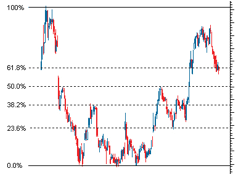
Fibonacci retracement works by taking two extreme points on a chart and dividing the vertical distance between the two points by what are known as the Fibonacci ratios. These ratios are 23.6%, 38.2%, 50%, 61.8% and 100% and the quotient of adjacent numbers in the sequence. Once these calculations have been done and the point defined they are noted on the graph using horizontal lines. These lines are interpreted by many traders as levels of support and resistance and are also used to help identify strategic places for transactions to be placed, and target prices or stop losses to be selected.
Technical analysis, like we said before, is not just about charts. It does, however, rely heavily on them and often uses chart patterns to assist in making trading decisions.
The underlying theory is that traders often expect chart patterns to repeat, and this prediction is what presents them with various trading opportunities.
The most common chart patterns are:
- Symmetrical Triangles
- Ascending Triangles
- Descending Triangles
- Double Top
- Double Bottom
- Head and Shoulders
- Reverse Head and Shoulders
Chart patterns - Triangles
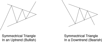
Triangles represent continuation patterns and there are three main types;
Symmetrical Triangles - Neutral pattern signaling breakout to either side, though usually a continuation pattern
So how do you spot a systematic triangle pattern?
Symmetrical triangles have distinct pattern signs and these can be seen in the image below
- Upper trend line downwards sloping
- Lower trend line upward sloping
- Both trend lines converging together
- Breakout to upside or downside being confirmation of trend in that direction
The slope of the price’s highs and the slope of the price’s lows converge together to a point where it looks like a triangle.
In the below example of a systematic triangle the market is making lower highs and higher lows. This type of price activity is called consolidation.
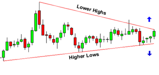
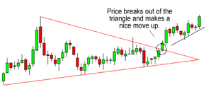
Traders who use symmetrical triangles are often looking for a breakout; i.e. when the pattern reaches a stage where the price moves decisively in one direction or the other. Much like we explained in the Bollinger “squeeze” a breakout often occurs after a consolidation as seen below; traders wait for the price to either move above the top trend line or below the bottom trend line.
Ascending Triangles - Bullish continuation pattern
Ascending triangles also have pattern traits with which you can identify it.
- Upper trend line horizontal / flat
- Lower trend line upward sloping
- Both trend lines converging together
- Breakout to the upside through upper resistance
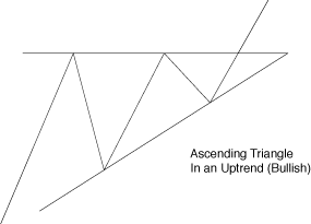
Ascending triangles are experienced in instances where there is a resistance level coupled with a slope of higher lows as seen below;
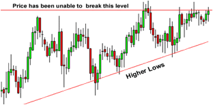
Again traders will often wait to see if the price finally breaks the resistance level, at which point the price could breakout decisively to the upside as seen below
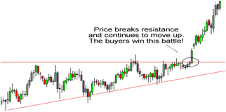
The alternative occurs when the resistance level proves too strong for an upward break through and the price move reverses downwards.
Descending Triangles – Bearish continuation pattern
Finally there are descending triangles; Descending triangles are essentially the opposite of ascending triangles.
- Upper trend line downwards sloping
- Lower trend line horizontal / flat
- Both trend lines converging together
- Breakout to the downside through lower support
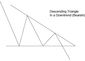
Above we can see a descending series of highs, which forms the upper line. The lower line is a support level in which the price cannot seem to move below.
Unlike with ascending triangles where traders are waiting for an uptrend breakthrough traders witnessing a descending triangle are expecting a bearish market and are waiting to see if the price eventually makes a breakout to the downside through the support level.
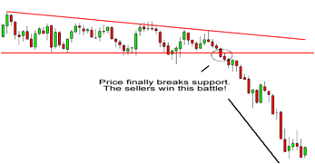
The alternative scenario will occur when the support level proves too strong for a downward break; the price will then be seen to “bounce” off of the support level and generally begin in an upward movement.
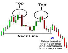
Double Tops – Reversal Pattern
A double top is a bearish reversal pattern that is formed after there is an extended move up.
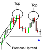
The “tops”, as seen above, are peaks which are formed when the price hits a resistance level that appears it is unable to break.
We can see in the diagram above that having bounced off the support level slightly the price then returns to re-test the support again. If the price is unable to break through the support level for a second time and is seen to bounce off of that level again, a DOUBLE top chart pattern has been formed.
Referring back to the diagram above again we can see that the 2nd “top” was unable to break the high of the 1st. Traders often interpret this as a strong sign that a reversal is going to occur as this movement implies that the buying pressure is lessening.
When using double tops as a form of analysis traders will often look to go short below the level which is referred to as the “neck line”. When the price level falls below the neckline traders will expect the reversal of an upward trend.
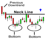
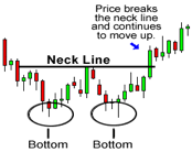
Double Bottom – Reversal Pattern
A double bottom is the opposite of a double top. It is a bullish trend reversal formation, meaning that unlike with double tops traders are now looking for the price to reverse upwards after it has been coming down.
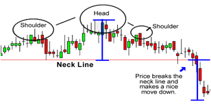
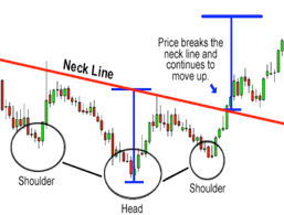
Head and Shoulders
Head and shoulders is another form of a reversal pattern which has two main types;
- Head and shoulders – Pattern formation that indicates a reversal in an uptrend [bearish]
- Inverse Head and Shoulders – Pattern formation signalling a reverse in a downtrend [bullish]
Head and Shoulders
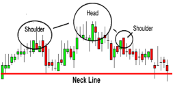
Head and Shoulders is formed by a peak, known as the “shoulder” which is then followed by another higher peak, the “head”. Following on from this high peak [head] another shoulder is seen depicting a lower peak.
Finally we can see that there is a neckline which is drawn by connecting the lowest points of the two troughs. Although in this case the neckline is a straight line it can be either upwards or downwards sloping.
Much the same as double bottom and top formations traders using head and shoulders will also look to sell once the price falls just below the neckline as it is thought to imply an impending downward trend.
Reverse Head and Shoulders
A reverse head and shoulders is pretty self explanatory; it’s a head and shoulders formation, in reverse.
An inverse head and shoulders formation is a bullish reversal pattern and so traders will look to buy when the price increases above the neck line as they will be expecting an upward trend break through.
Japanese Candlestick Formations
Basic candlestick patterns - Spinning Tops
A spinning top is one of the most commonly seen candlestick patterns. This type of pattern is often regarded as neutral and indicates indecision between buyers and sellers and the future movements of an asset.

We can see above that the body of the spinning top is small despite there possibly being a large amount of price fluctuation during the day. It is also either green or red in colour, indicating an upward or downward sentiment.
Traders use the presence of a spinning top to predict whether there is an impending up or downward trend. For example if after a long uptrend a spinning top forms this generally means that buyers have begun to lose interest and it is indicative of an impending downtrend. The opposite is also true.
Basic candlestick patterns – Marubozu
Marubozu pattern at first glance looks very similar to the spinning top candlectick formation described above.
The main differences between the two are that the marubozu are larger in size and unlike spinning tops do not have shadows. Again the two colours, green and red, indicate whether the market is bullish or bearish.
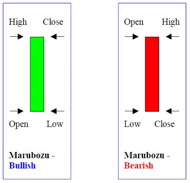
We can see for example in a bullish market that the open price = low price and that the high price = close price. The green marubozu pattern is often seen as the first part of a bullish continuation or a bullish reversal pattern and so may traders will buy into a market in which they see a bullish marubozu.
The opposite here is the bearish marubozu which is seen in red. In this case the low price = close price and open price = high price. A bearish marubozu implies an impending bearish reversal or a bearish continuation and so many traders use the red marubozu as an indication to sell into the market.
Basic candlestick patterns – Doji
Doji candlesticks are said to be “neutral” as they do not indicate a definitive upward or downward trend and so indicate indecision amongst traders.
Doji candlesticks are in a way similar to spinning top candlesticks in that they have very small bodies, in the case of Doji the body is simply a bar as seen below. Also similar to spinning tops, Doji candlestick patterns can be seen to display long shadows.
There are four main types of Doji candlesticks;
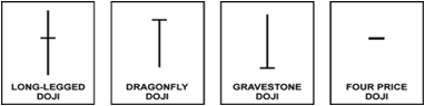
First let us look at the long-legged Doji – here we can see that opening and closing prices were essentially equal. This long legged Doji implies that there is almost equilibrium between supply and demand and that there may be a turning point in the prices direction approaching.
Next there is the dragonfly Doji – similar to the long-legged Doji the dragonfly Doji also forms when an assets opening and closing prices are equal. The long bottom shadow however means that this equilibrium took place at the high of the day. Again it implies that the direction of the trend is nearing a major breakthrough with the longer lower shadow implying the possible reversal of a bearish trend.
A gravestone Doji is essentially the opposite of the dragonfly Doji explained above. It forms when the opening and closing prices are equal and occur at the end of the day. The long upper shadow implies that the days buying pressure was countered by sellers and that a bullish uptrend is about to be reversed.
Finally a four price Doji is a candlestick formation where the day’s high, low, open and close price were all equal. This is the most neutral of all the Doji candlestick formations and does not occur often. It is seen mostly in times where there is a very low volume of trading such as after hours and is often disregarded by traders as being a result of bad data.
Although Doji Candlesticks are important, it is their combination with preceding patterns which traders look most at. For example, if a Doji candlestick appears after a series of candlesticks with long green bodies it is an indication that buying pressure is weakening. Conversely, if a Doji candlestick is seen after a series of red candlesticks this is an indication that selling pressure is weakened.
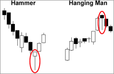
Basic candlestick patterns – Hammer and Hanging man
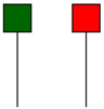
The hammer and hanging man look very similar with short bodies and long lower tails, but they have very different indications.
The hammer, which can be seen above on the left in green, is a bullish reversal pattern that forms during a downtrend. When prices are falling hammers signal that the support level has been approached and prices may well begin to rise again. Traders often take a hammer man as in indication of an impending price rise, but it is always safer to wait a while and confirm a bullish trend before buying.
The hanging man, which can be seen above in red, is the opposite of the hammer man. It is a bearish reversal pattern that often is seen to mark a top or strong resistance. When price rises the formation of a hanging man is often taken by traders as an indication that selling pressure is larger than upward buying pressure.
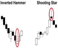
Basic Candlestick Patterns: Inverted Hammer & Shooting Star
The inverted hammer occurs when a falling price indicates the possibility of a reversal. Its long upper shadow as seen below showing us that buyers are attempting to counter the downwards pressure and were able to close the session near its open as opposed allowing the price to be pushed down further.
The shooting star is a bearish reversal pattern that looks identical to the inverted hammer but occurs when prices have been rising.
Its shape indicates that the price opened at its low, rallied, but pulled back to the bottom. Conversely to the inverted hammer the shooting star shows us that sellers countered the upward pressure of buyers and were able to keep the day’s close almost equal to its open and avoid any further upward pressure.
We’re finally done analysing; and now that you know the basics of both technical and fundamental analysis it’s up to you to put your newly learnt skills to use. It depends on your trading style, your objectives, your time frame and many other factors. Don’t put yourself in a box and stick to one style, there’s value in diversity.You can use any or all of these different methods as each complements the other. Many investors use technical analysis and graphing to decide on strategic exit and entry points, but use fundamental analysis to decide which asset to trade on. There’s limitless combinations, and limitless opportunity – good luck with your trading!